|
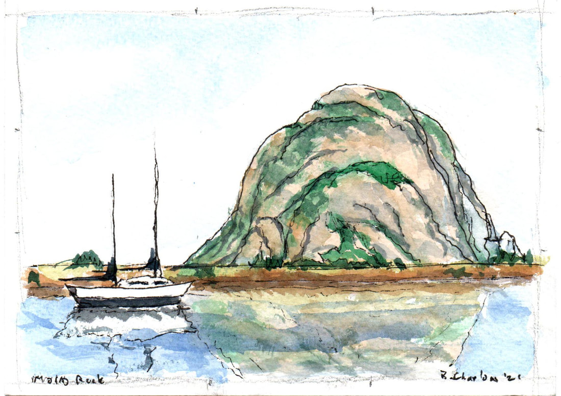
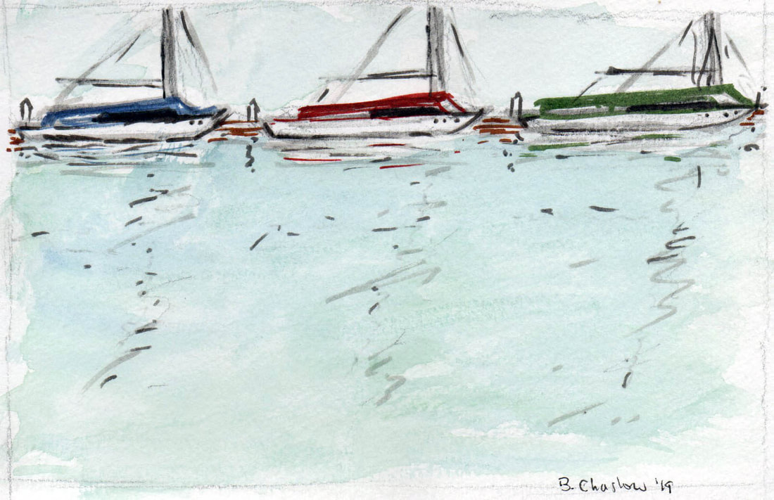
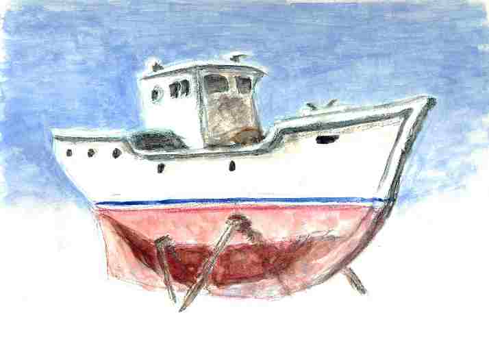
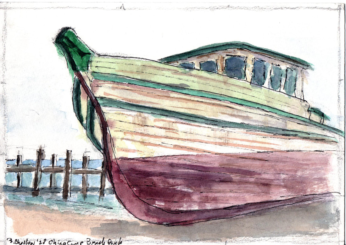
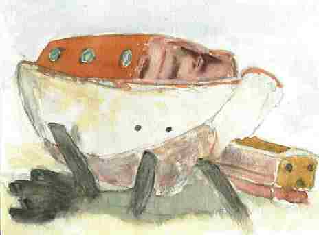
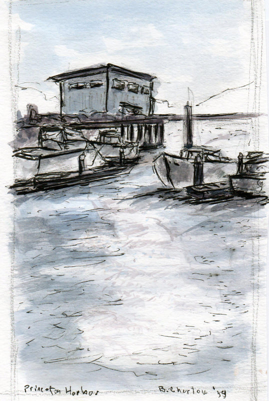
Sometimes I avoid boats - too many details, too complicated. Sometimes I simply cannot avoid them - sinuous lines, patina of age and the sea exposure, color and dramatic angles. Here are a few done over the years that did attract my eye and didn't distract me overmuch with impossibly complex details. See what you think.
0 Comments
Back in 1964, Canadian theorist Marshall McLuhan kicked off a whole field of communication theory with his book, The Medium Is The Message. It was a catchy phrase that made it a best-seller, that is often translated into ordinary language in a couple of different ways. 1) “The medium is the message” is a phrase meaning that the form of a medium embeds itself in the message, creating a symbiotic relationship by which the medium influences how the message is perceived. 2) Long before the creation of the Internet, implying that it's not so much what is being said but how that is important. He confused a lot of folks by even considering a light bulb to be a "medium", but beyond all that, was he right? Could be. In applying those concepts to my art I find the former to be more prevalent, but some of my colleagues might exemplify the opposite in theirs. Looking at the painting comparisons below: - Left basket is gouache meant to convey the apples by contrast; right basket is Ceracolors (cold wax) meant to convey the apples by color. - Both pear paintings are meant to convey volume and shape by using color and shading, but the left one is in Ceracolors while the right is in watercolor pencil. - Left landscape in pastels on colored paper is meant to convey time of day and weather via color and both horizontal and vertical lines; right ink on paper is meant to convey only horizontal rhythm of shapes. How do you see them? 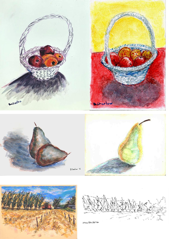 |
 RSS Feed
