|
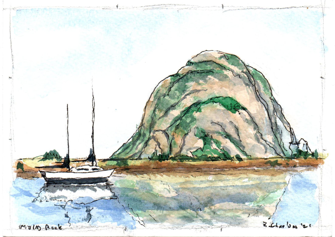
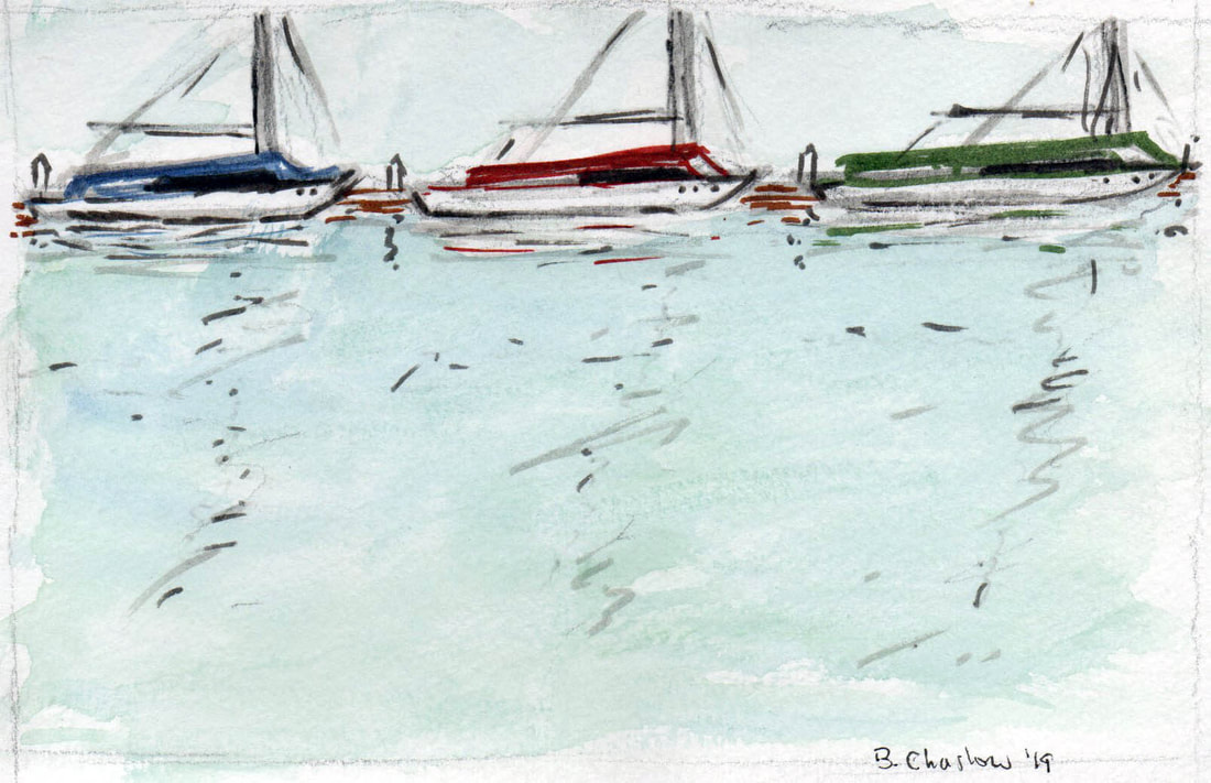
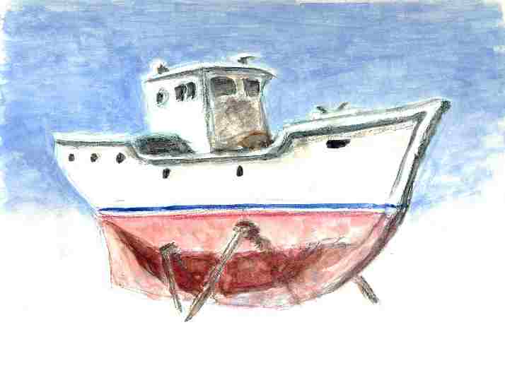
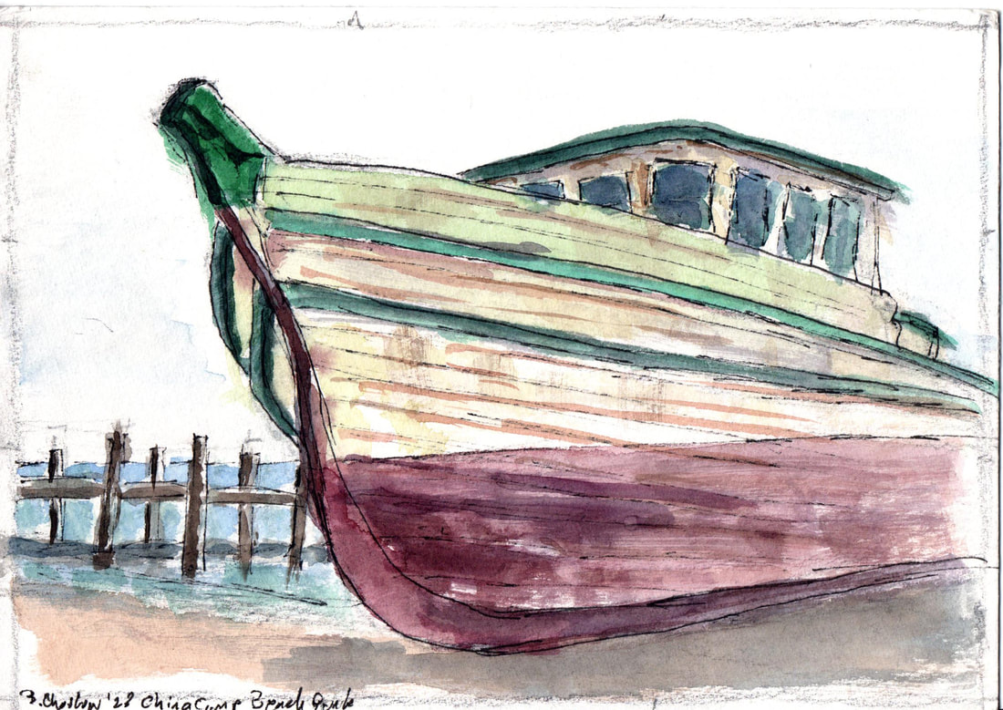
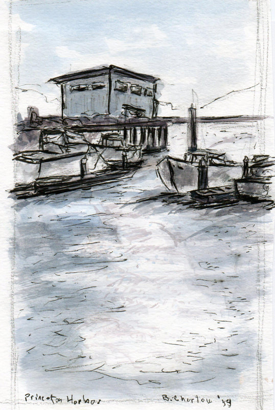
Sometimes I avoid boats - too many details, too complicated. Sometimes I simply cannot avoid them - sinuous lines, patina of age and the sea exposure, color and dramatic angles. Here are a few done over the years that did attract my eye and didn't distract me overmuch with impossibly complex details. See what you think.
0 Comments
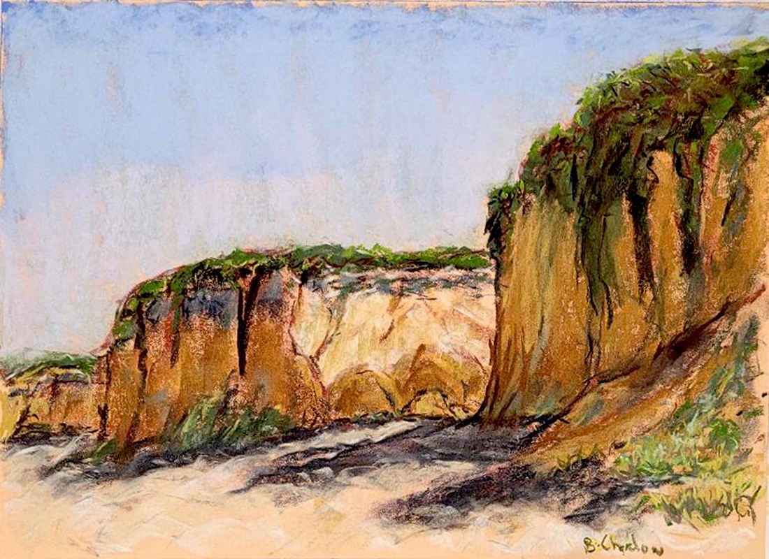
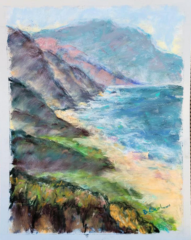
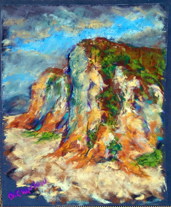
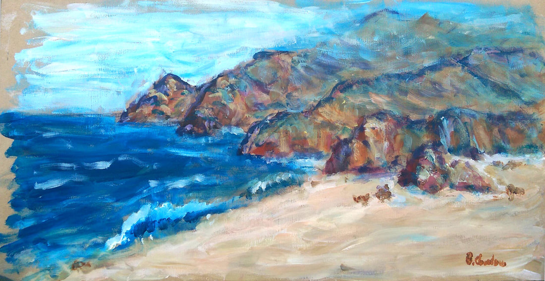
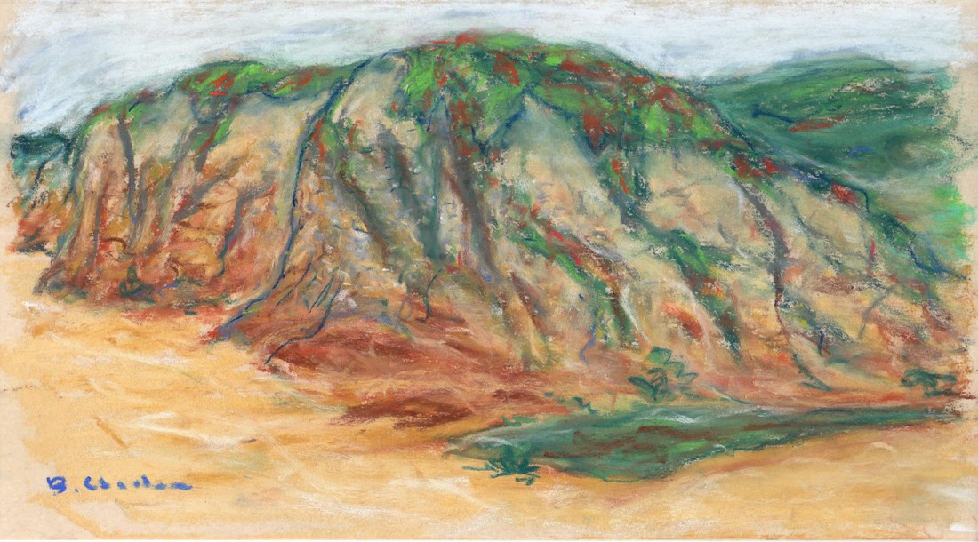
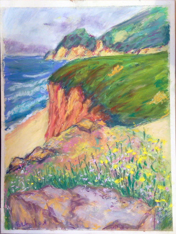
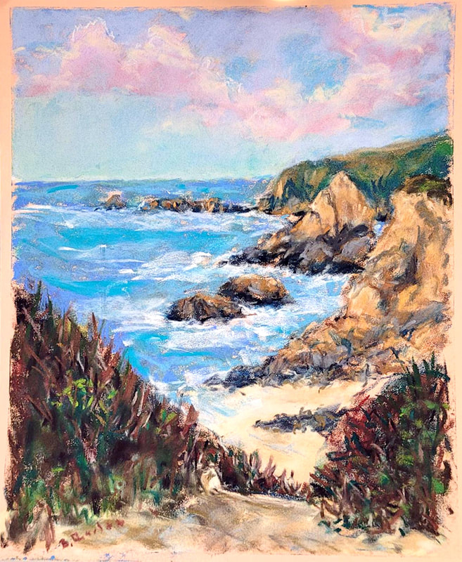
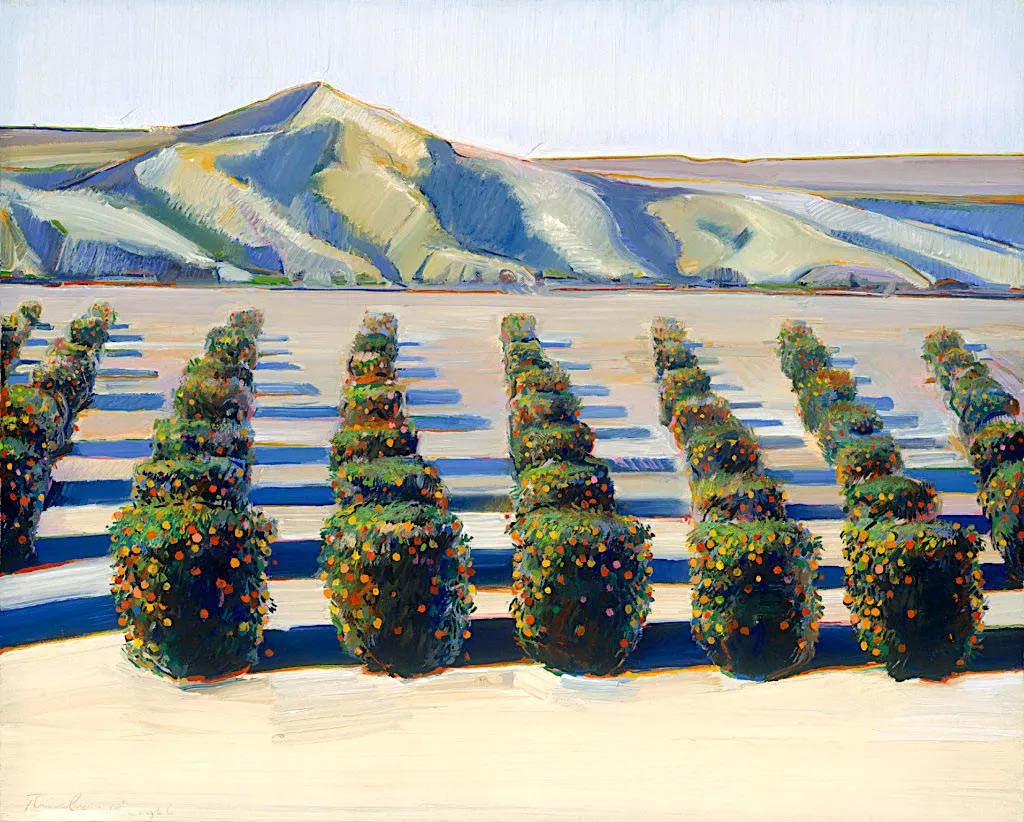
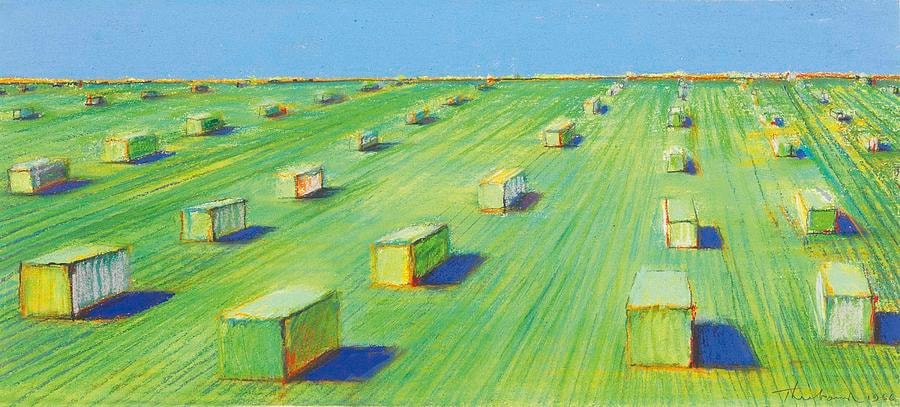
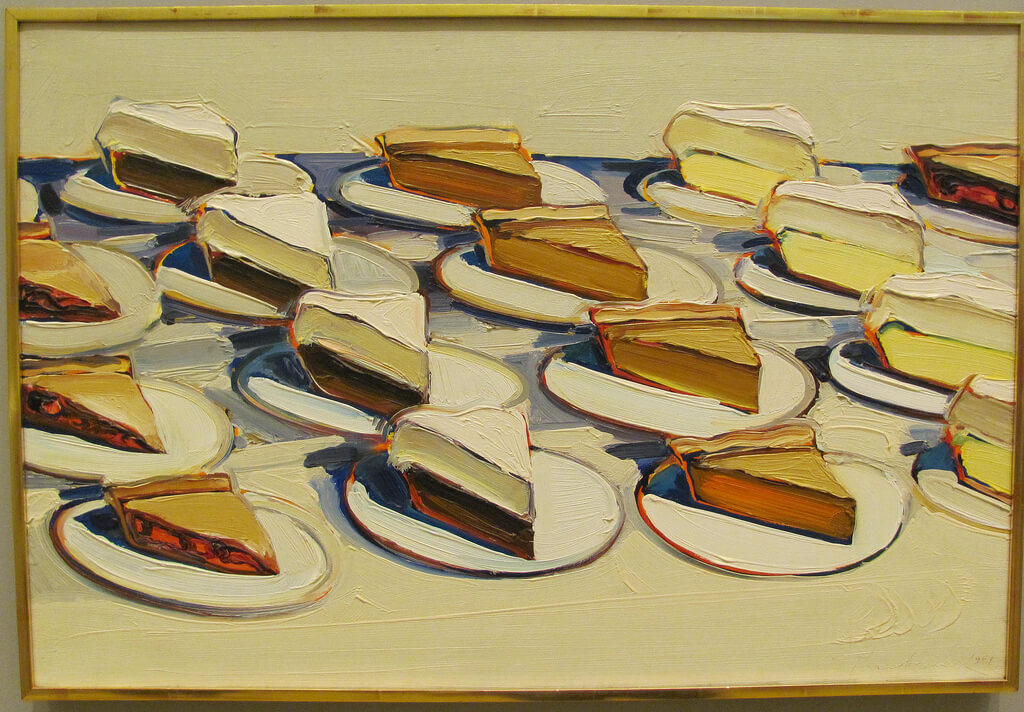
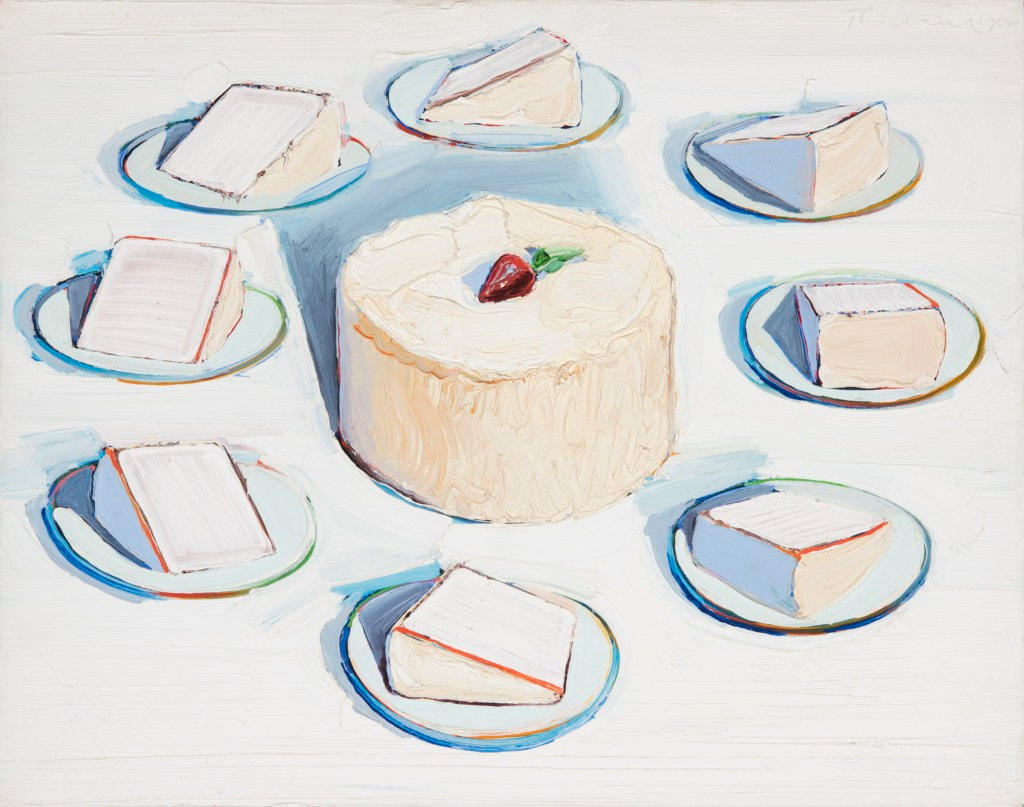
Back in 1964, Canadian theorist Marshall McLuhan kicked off a whole field of communication theory with his book, The Medium Is The Message. It was a catchy phrase that made it a best-seller, that is often translated into ordinary language in a couple of different ways. 1) “The medium is the message” is a phrase meaning that the form of a medium embeds itself in the message, creating a symbiotic relationship by which the medium influences how the message is perceived. 2) Long before the creation of the Internet, implying that it's not so much what is being said but how that is important. He confused a lot of folks by even considering a light bulb to be a "medium", but beyond all that, was he right? Could be. In applying those concepts to my art I find the former to be more prevalent, but some of my colleagues might exemplify the opposite in theirs. Looking at the painting comparisons below: - Left basket is gouache meant to convey the apples by contrast; right basket is Ceracolors (cold wax) meant to convey the apples by color. - Both pear paintings are meant to convey volume and shape by using color and shading, but the left one is in Ceracolors while the right is in watercolor pencil. - Left landscape in pastels on colored paper is meant to convey time of day and weather via color and both horizontal and vertical lines; right ink on paper is meant to convey only horizontal rhythm of shapes. How do you see them? 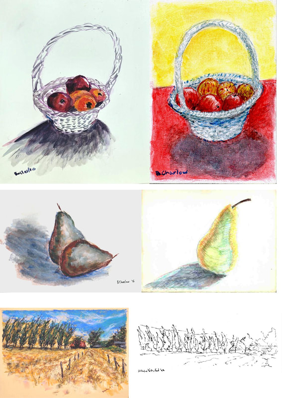 As with Wayne Thiebaud, my paintings of the California coasts are pretty much the same conceptually: shape and shadow studies. That's because the contours of the beach cliffs are shaped into repetitive forms as you look across a panorama. Wind and waves hitting the rocks from the same directions over the years and millennia create the same shapes over and over again. But also as with Thiebaud, they could as easily have been buildings, or with a little more imagination something like his cakes. Do you get the picture? Reminder that our opening night for the "Canopy: The Sheltering Trees" exhibit at Sanchez Art Center in Pacifica is a week from now: Feb. 23rd from 7 - 9 PM. Bring friends, relatives, neighbors, even folks you pick up on the street! And spread the word on your social media, please. The show will be up for a month through Mar. 24th. There will be a gallery walk with the artists on Sunday, Mar. 10th from 1:30 - 3 PM 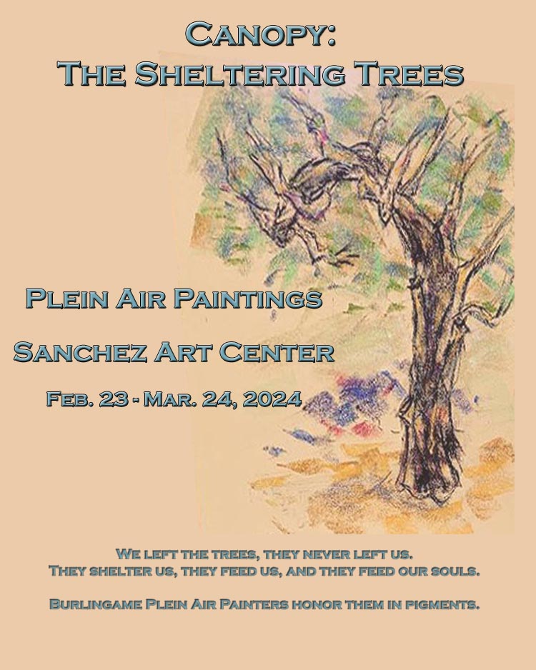 Much of painting is in fact rendering shapes in light and shadow. Sure, you can add color and really play with its ramifications, but the shapes in different values (white, grays, black) are the heart of a painting. Wayne Thiebaud is a sadly now deceased modern master, one of the inheritors of the Impressionist traditions, even though most people would only know his 1960s pop art paintings of lunch counter items. Believe it or not, those paintings were really just color shape studies (in my opinion) that informed his explorations later into landscape. Yes, cakes as landscapes, landscapes as cakes! If you understand that, you will fathom that these paintings are really explorations of the same shape and value studies, to which he masterfully adds playful color (more about that another time.) Do you see it yet? Some subjects, some views grow old. Photographing them, painting them over and over can feel played out. But you can never rule out a new angle on an old theme, because a minor shift in light, or the sky, or the perspective can bring out the same excitement. I've done the pix and the paintings of Pigeon Point Lighthouse in Pescadero, CA so many times over the past 49 years and somehow I never tire of this place. Apparently Hollywood doesn't either, because the classic shapes and scene, the architecture of the lighthouse can be made to mimic anywhere on the East or West Coasts. A couple of months ago our group was out there enjoying everything from the flowers to the sea otters, and yet again I was captivated by the lighthouse and a couple of its attendant structures. Simple watercolor and ink was enough. Nothing spectacular but always captivating in its iconic presence. For the record here are both my very first "serious" watercolor of the lighthouse from about 30 years ago and the latest. 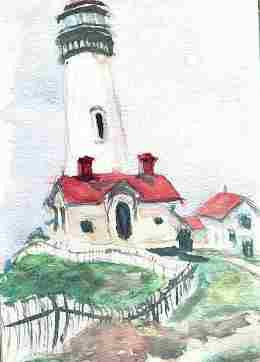 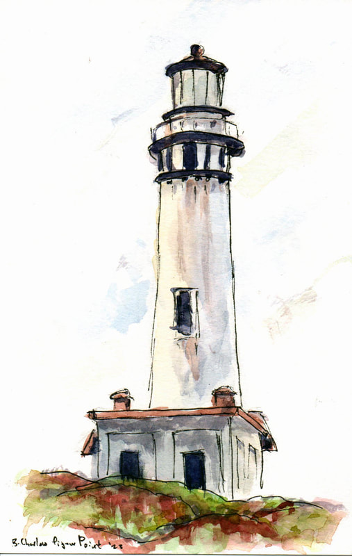 Jacques Pepin, one of my favorite chefs and cooking authors illustrates his books and his menus for his family and friends. I loved the idea from the moment I saw his fresh creative designs. Any idea good enough to publish is good enough to consider borrowing, so I did! When I invite our close friends over for a nice dinner I'm displaying two sides of my creativity: cooking and painting. Artistry in the kitchen - literally since I spend energy on the composition and color of the food as well - and artistry with the brush. It's fun for me and our friends always check out my hand done menu first. Here are some for your enjoyment. Sorry, but the food is all gone. 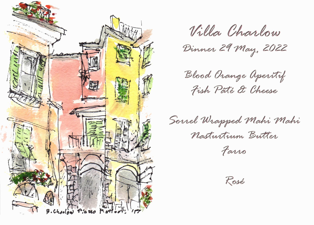 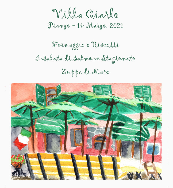 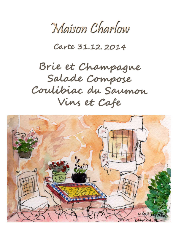 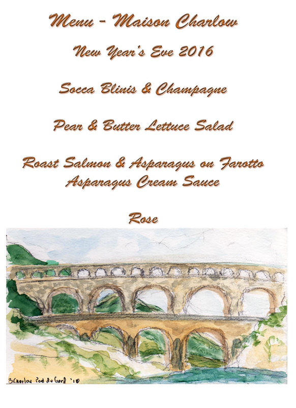 "Treeptych" is part of the publicity for our next Burlingame Plein Air Painters show at the Sanchez Art Center in Pacifica. It will run from the opening night invitational on Feb. 23rd, 2024 through Sunday March 24th. 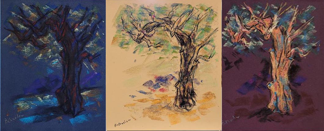 One additional piece of mine was also chosen by the judges for exhibition, "Bower".  And here is the publicity poster for the show: In honor of my 75th birthday, Nancy unearthed my first painted portrait. I created this one in acrylics when I had first begun painting. So this is a 45 year old view of myself. Below it is a more recent self-portrait at 73 painted in Ceracolors. Quite a difference! 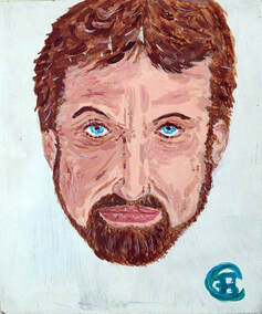 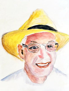 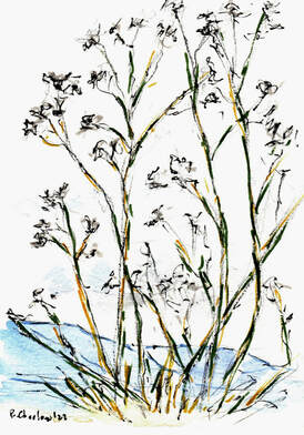 Every artist who expects to learn from experience will have a "fail" at least once in a while. I'm no exception, though I would of course love to be in this case, LOL.
Last weekend I was really struggling with a pastel of a copse of trees and bushes in raking light alongside a path. It came out so poorly that I won't even post it anywhere, despite my struggling with it. In fact, the very act of struggling resulted in an overpainting, something I like to avoid. Enough said about the disappointment. With extra time on my hands painting with our plein air group, I sat next to my friend, who was painting a landscape in the other direction. He was contemplating whether to add a front "screen" depicting the wild fennel as a foreground to his expansive view. From my perspective, the simple Zen-like beauty of the dried fennel stalks and seeds against the sky and the mountains was quite enough of an inspiration. So I broke out my colored pens and created this gentle, subtle but lovely piece. The old Zen sumi-e painter in me rejoices. See if it moves you too.  My painting, "Winter Morning Mist on the Reservoir" is in a show now through January featured at the Coastal Arts League Gallery in Half Moon Bay.
I'm honored to have it selected to hang among so many other great regional artists' work. Go see it! 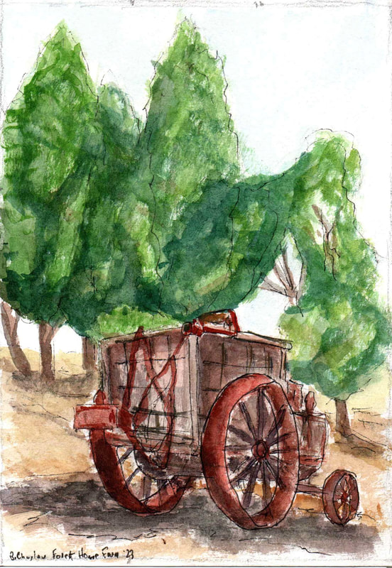 You may have noticed that I go back and forth between several painting media. No sense being stuck or type cast, at least not for this creative artist!
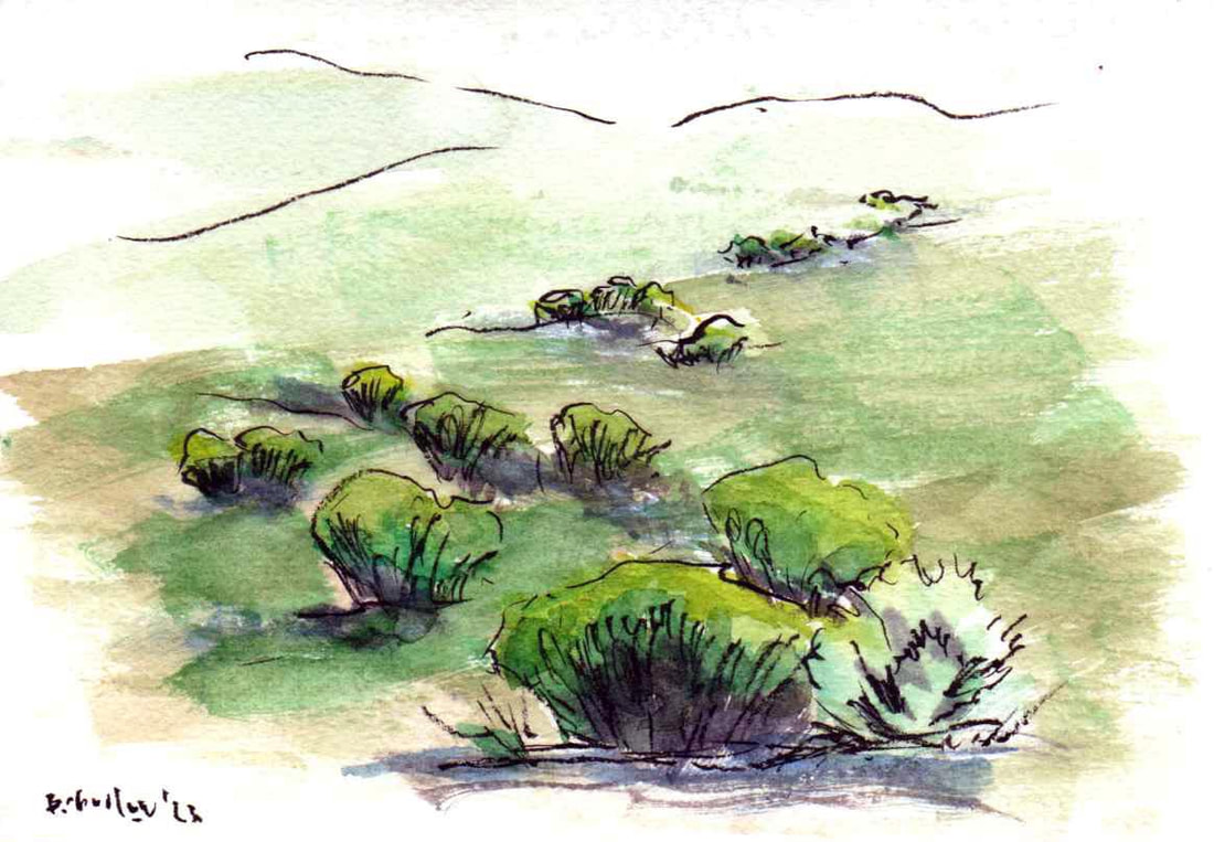
My go-to medium is watercolor, most often what's called "line and wash", generally pen outlines with a wash of watercolor within or even outside the lines. It's an illustrator's technique, so if it reminds you of books or magazines you've read, that's why it looks so familiar. Line and wash allows for detail enhancement, and for me it's about the quickest way to paint, most taking 20 - 30 minutes. The antique farm wagon was captured on paper at Forest Home Farms Historic Park in San Ramon, CA. Lovely setting full of old farm subjects. There was a handsome quarter horse on the ranch, but he declined to stand still for his portrait. Do you see how the lines enhance the sense of detail, even as there really isn't that much detailed specifically? As the talk show host used to ask, "Is that your FINAL answer?" I said "Banty Rooster" was influenced by 3 painters and one sculptor. The sculptor is my trick question. He was the originator of modern stylized stick figure sculpture and a master at eye-twisting 3 dimensional depictions of heads. Bet you didn't get this one without the hint! 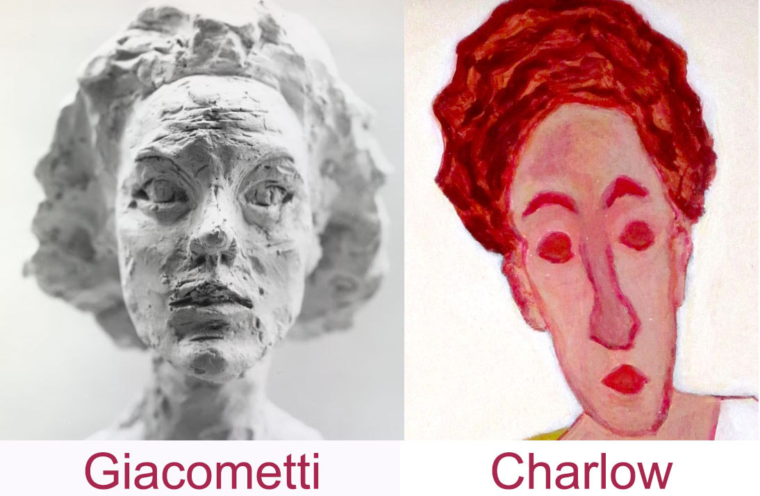 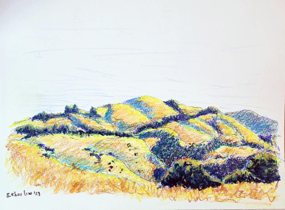 "Grasshopper Loop Trail", La Honda, CA. 16x12" Neocolor II on paper, 2023 Even a Kung Fu master must start by learning, and I'm learning this new medium, Caran D'Ache Neocolor II, which they call "pastels" but are really crayons. Not your old Crayolas, BTW, they are actually sticks of watercolor in a waxy base.
Practicing on Grasshopper Loop in La Honda, CA, I captured the typical California hill scenery on a hot summer day. These are the rolling hills dotted with scrub and coast oaks that the California Impressionists painted so often. Modernized and stylized by Eyving Earle in his famous prints, and rendered in boldly colorful watercolors by Robin Purcell. It's a land form that looks like rolling ocean waves, golden when sere from the seasonal heat, molded by the shadows of a blue summer sky. Very reminiscent of Tuscany, by the way. Can you feel it? Having fun yet guessing which 3 painters informed "Banty Rooster"? You might not have caught this one, who was well known for his expressive depictions of hands and legs, and he certainly liked to look at legs! 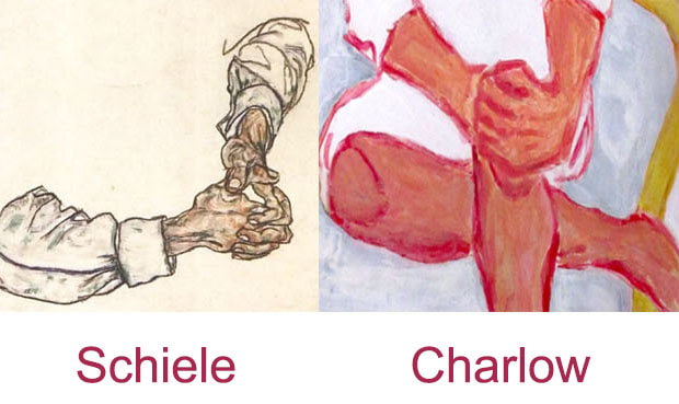 I don't often paint mutiples, variants of the same scene. That's not the same as returning to a place and finding new inspiration with different light and composition however.
This time our plein air group was out at Portola Vineyards, where repeated drizzle showers chased a lot of the group away. I stuck with it because I was determined to finish this triptych of a gnarled tree. I have painted this lovely tree twice before. This time I wanted to try it in a different style with widely varying colors. The style is as close to sumi-e as I could get using soft pastels. And I feel that composition and style choice worked well. Here it is on 3 primary saturated colored papers - same tree, same composition, same drawing. Only this time it is designed to be presented as a full set, not individual paintings, hence a triptych, which I titled "Treeptych" for fun. Enjoy! 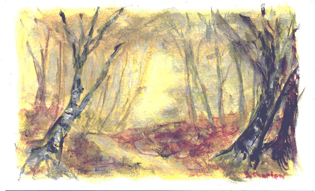 "Tonalism" is an art term that confuses some folks. It has nothing to do with musical tones (though I admit that Jobin's "One Note Samba" is a musical fellow traveler.)
It's the use of limited muted color range and most often low key. Low key translates into most of the picture being on the darker side. Though the hues may appear duller, the paintings are anything but dull, and usually convey an emotional sense in a landscape. George Innes was the renowned American tonalism master. This painting above is done from imagination, derived from a zillion walks mostly in the Eastern US woodlands. Think of it as an archetype, not a photograph. It is deliberately restricted in color range, but like many tonalist paintings, there is at least one point of value contrast (light against dark) to draw the eye. FWIW, it's also one of my first paintings in Ceracolors. Those are cold water soluble wax based paints that have been modernized from a 2,000+ year old recipe. Ancient medium, classic composition, modern rendition. Can you hear the music of the fall forest in the morning mist? 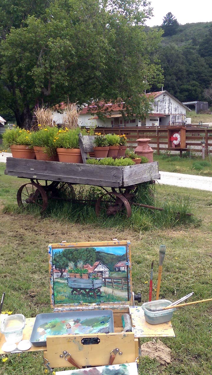 "TomKat Ranch", 12x9" acrylic on board, Pescadero CA $350 unframed In my paintings I try to capture the lyrical, rather than the literal. Painting a scene to mimic what a camera might record makes some artists and their viewers happiest, and deviating from that causes them some visual and mental discord. For me it is the opposite. I want to capture the feeling, an emotion that you can read in the finished work that mimics what I felt on viewing it. That is not the flattened hyper-realism that a camera captures so well. And I don't believe that AI has yet reached the level of the lyrical. In much classical Western art realism takes the form of filling a canvas with recognizable details and sometimes even slavish adherence to the scene. It may well be quite accurate in the hands of a skilled painter, but it brings me far less joy. Here you see a photo of a farm scene at TomKat Ranch in Pescadero, CA, and the more literal first painting I made of it on the easel. Below you can see what I painted the same day that better captures what I FELT at the time viewing the flower wagon. Do you get the idea? 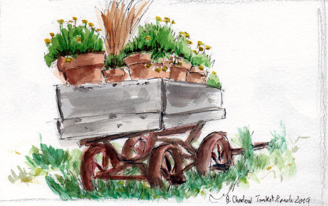 OK, the first painter who informed "Banty Rooster" may have been obvious, but how about the second one? This famous painter was known for stylized depictions of cabaret life and denizens. Did you get it? 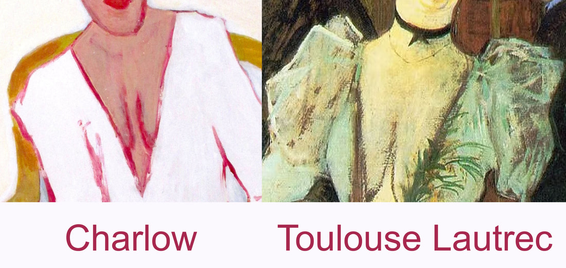 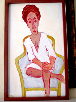 As a reminder, "Banty Rooster" is the painting I'm referencing. I've revealed two answers to Pop Quiz, the first two painters. One more painter to go, then the real test of your art knowledge: the sculptor.
 Some folks believe you cannot teach composition, some instructors beat it to death. My belief is that you can certainly learn to recognize composition and use it. But what is it? Simply put, it's the techniques you choose to organize the picture space to draw the viewer's eye where you want it to go. But it isn't simple, because there are quite a few ways to employ it: lines, values (light to shadow), color, focus, any and all of those put together. Without necessarily becoming an artist, a good viewer can learn to read compositional elements, and a good artist does need to be able to employ them or skill with a brush won't compensate for lack of it. Viewers can get lost in identifying recognizable objects or items in a painting, while missing the underlying structure that actually makes or breaks it. It's not the subject that matters most (unless you have that particular interest), it's the execution. Take a look at Wayne Thiebaud's famous pies on a lunch counter series; then look at his later landscape works, particularly of trees in an orchard. Different subjects entirely; the same compositional structure. If you look at the simple painting above you may note the composition, which draws (no pun intended) on a line from foreground to visual background. Then look at the one below of a completely different subject, but using the very same primary compositional device. Do you see the Z? (Hint: it's backwards.) 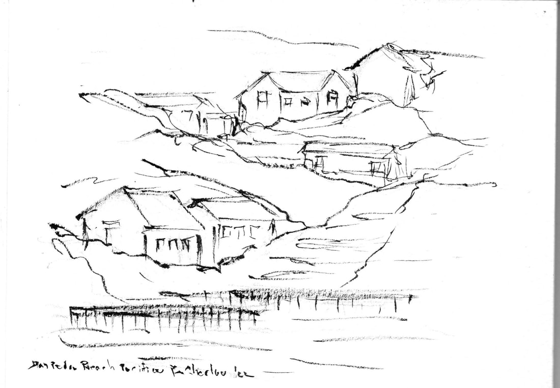 |
 RSS Feed
